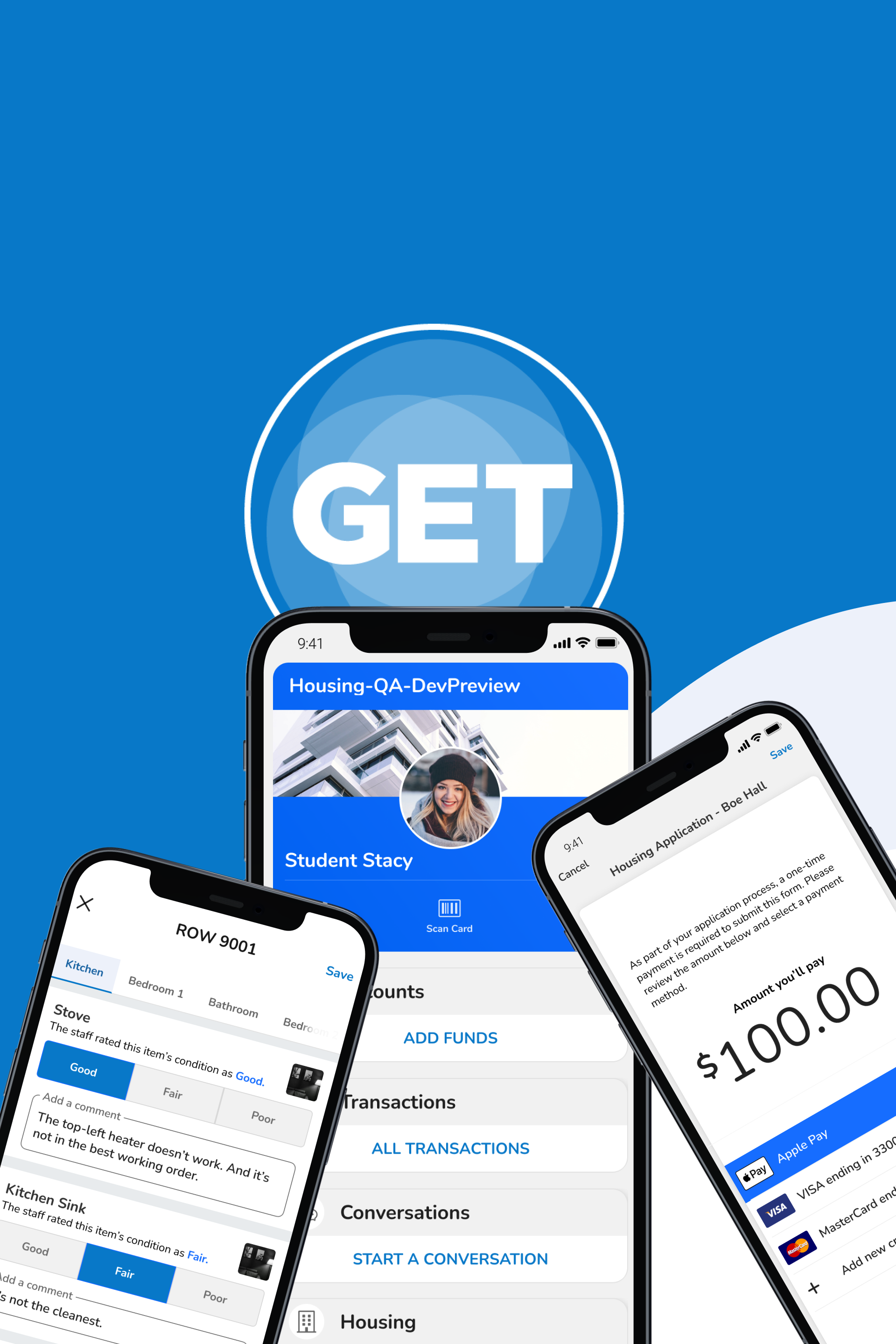
As a member of the UX team, I was asked to perform an holistic review on ResCenter, a product designed to help housing administrators manage student profiles in the GET mobile app (Case study on that how I improve that here). To improve its usability, I had to review ResCenter through the following 10 criteria.
A Short Guide to the 10 Usability Heuristics
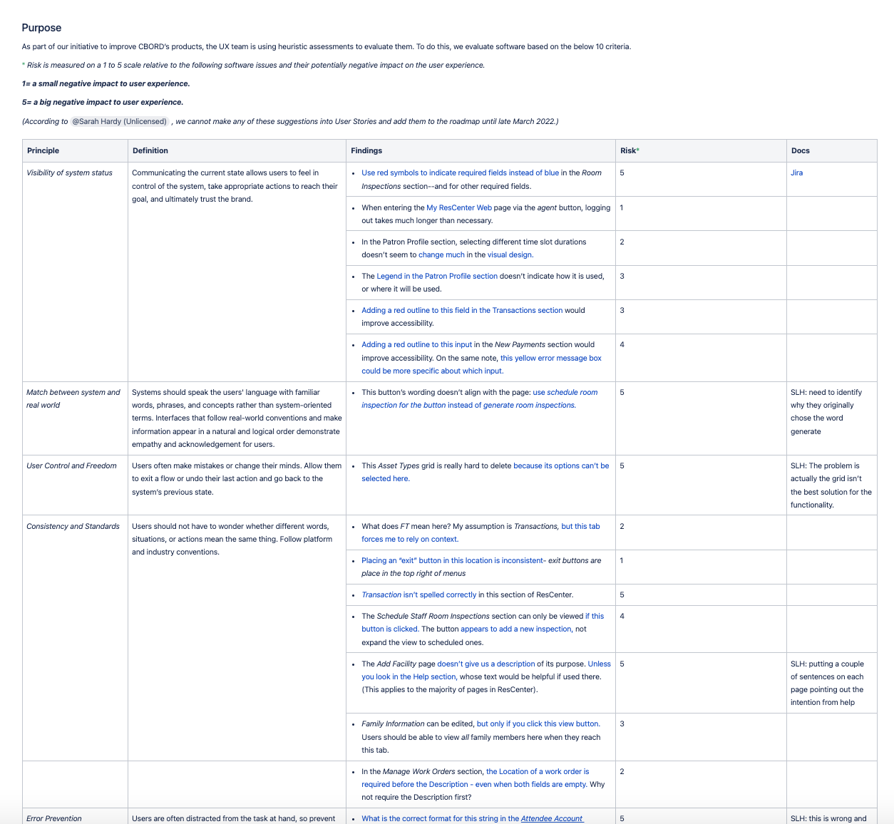
According to this article written by the Nielsen Norman Group, the 10 Usability Heuristics are principles that govern the guidelines for proper userinterface design. They are as follows:
To improve ResCenter, I had do some software sleuthing.
ResCenter was already an established product in its market, as it was closely coupled with CBORD's GET Mobile app. Attacking this problem required a multi-faceted 3 prong approach.
Observing the software application via field research & documentation. I had to figure out how to access the application and click through it to get an idea of how it currently functions.
Documenting any usability issues that occurred. Once I documented these issues, I had to make note of them and notify stakeholders.
Leveraging knowledge from the surrounding team. The Housing team had experts on this product, and I had to request their help to understand the product better.
Heuristic #1: System Communication
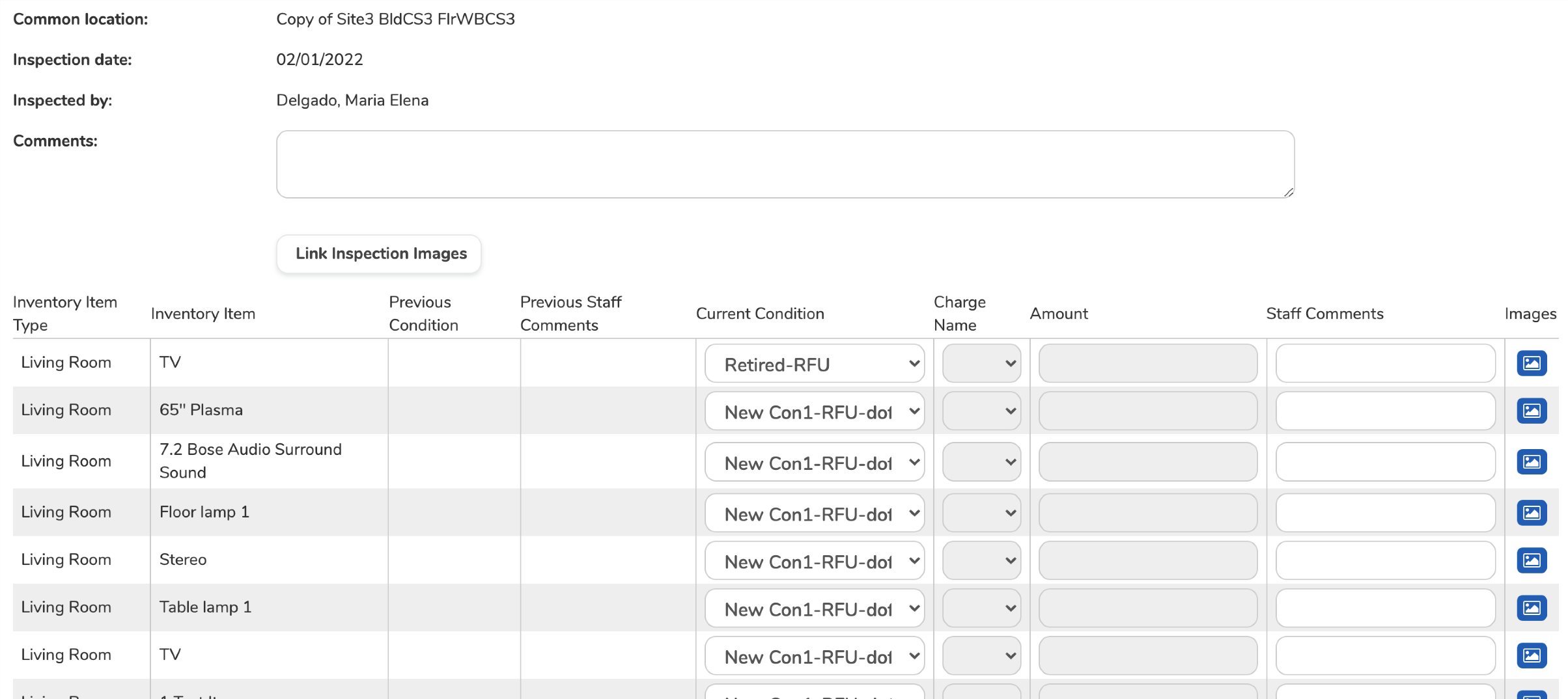
Upon initial observation, ResCenter showed many problems in this area. Below are some areas where ResCenter needed improvement in system communication.
Red asterisks would improve the visibility of required fields. I suggested to the team that the current blue versions blended in with the rest of the system and actually decreased visibility.
Outlining mistyped fields or missing fields with red makes them more visible. I suggested that the ResCenter team improve accessibility by considering this crucial factor in its design.
Error messaging for certain situations wasn't specific. I suggested that the ResCenter Housing team improve how that messaging directs users to the right solution.
Heuristic #2: System Language
The technical language within ResCenter needed an update. In some areas, it appeared to lack context and this lack of context could led to users making decisions they didn't intend to make. Below is one such example.
A certain button's language did not specify what occurred when it was pressed-- it simply presented incorrect language. I suggested that this be changed to something more appropriate.
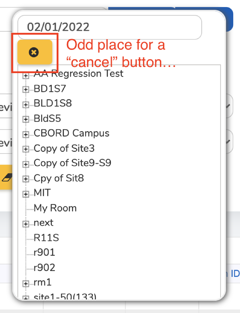
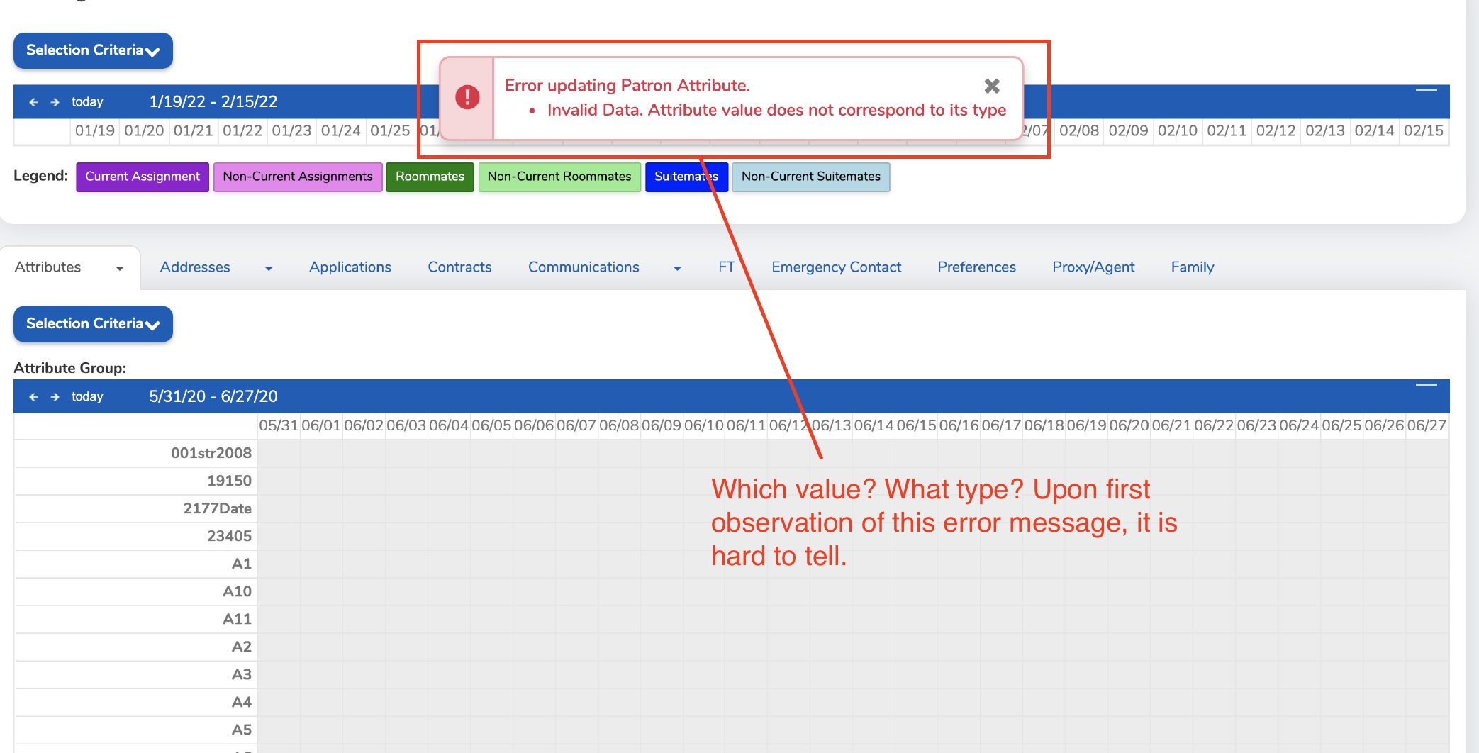
Heuristic #3: System Control & Freedom
In ResCenter, there arose many instances where modals lacked context, lacked appropriate button hierarchy, or were just plain inaccessible. Below is an example of such an issue I discovered and reported to the Housing team.
Modals are supposed to be accessible, not difficult to see. In this example, the user cannot make an important decision.
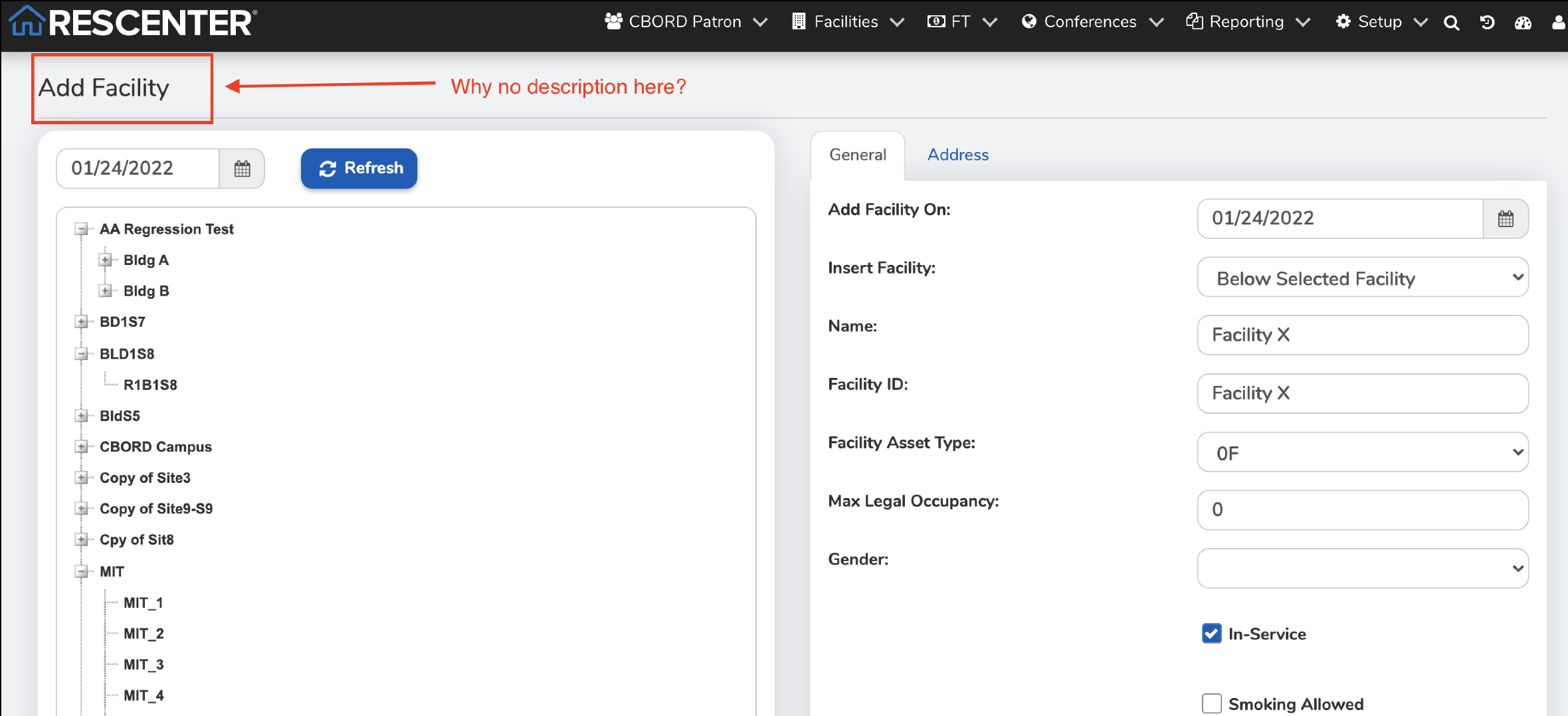
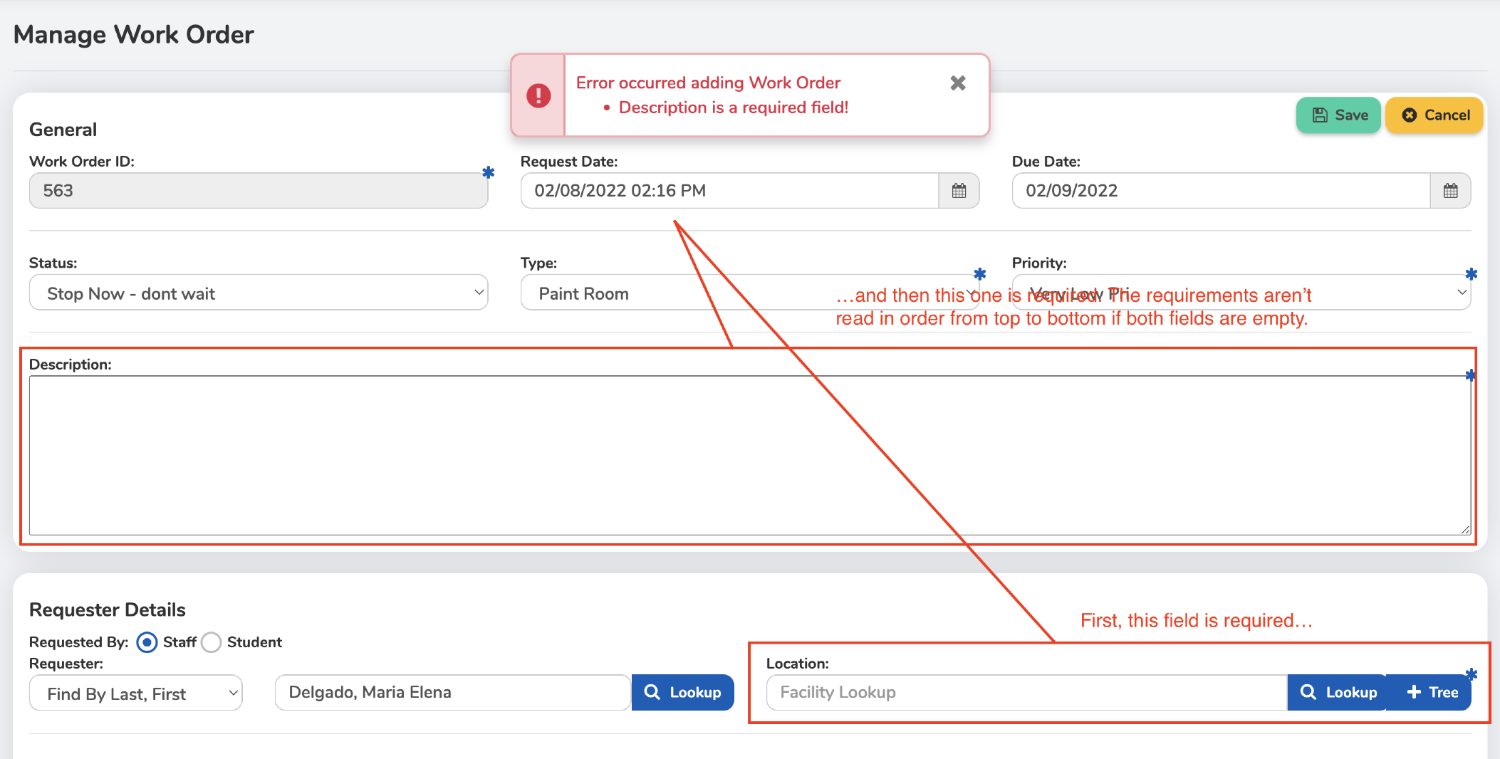
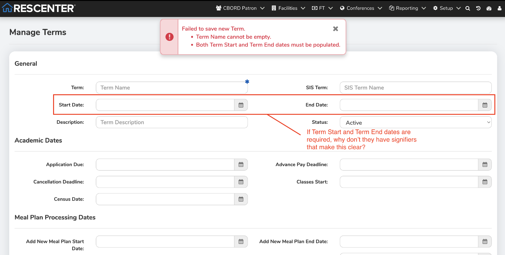
Heuristic #4: Mental Modelling
When it was built, ResCenter didn't have the appropriate guidelines in place for users to adhere to mental models they normally see. As a result, buttons and other components seemed out of place. As the designer, I identified areas where these issues can be improved.
A common approach to systems such as these is to provide context language, which was missing in this example. Because of that, I didn't know the purpose of the page.
Here, there is an issue with the order in which fields are required. The first-most field must be above the one that is required second, but in ResCenter this heuristic is ignored - much to the user's discontent.
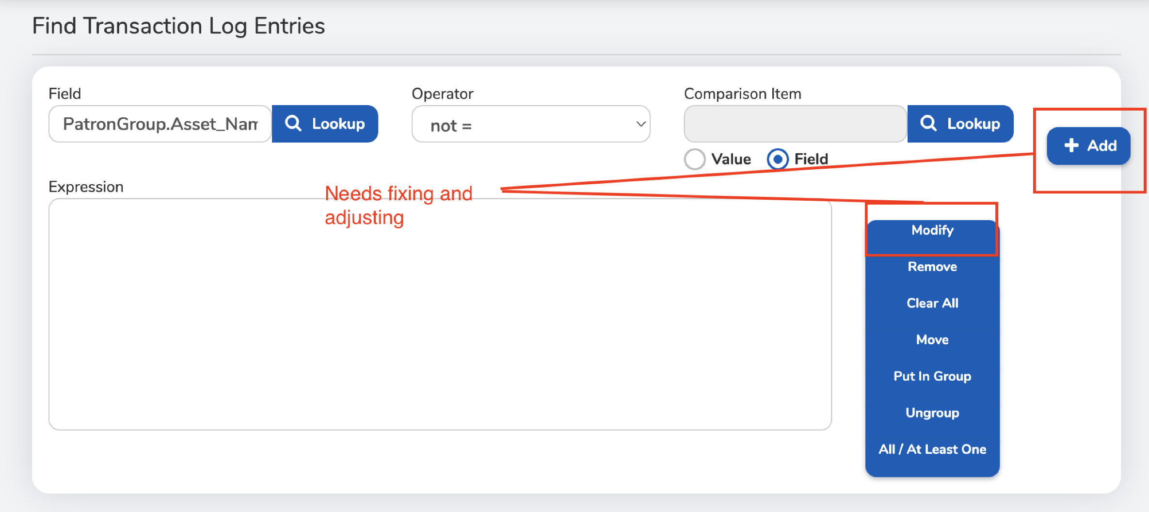
Heuristic #8: Good Design
Design can make or break a system's usability. That's why it's important to think about the details. Good design makes a user experience great, but bad design cripples a user's thought process and foils their goals. Below are some problems I identified within ResCenter.
In the Find Transaction Log Entries menu, buttons are misaligned and don't handle responsive design very well. This could be an issue for users who have eyesight limitations.
Users need minimalist interfaces to do the best work. On the opposite end, ResCenter's UI was often crowded with bulky tables, dropdown and buttons that felt misplaced.
Heuristic #9: Help Reduce User Error
A system should, in the least, provide users with enough context to properly solve their own problem so they don't need to contact support. This reduces the user load on the product's customer service department. ResCenter had quite a few issues in this department however. Below are some examples.
Error messages in the Patron Profile section did not help me understand what to do in. I suggested that the ResCenter Housing team address this issue.
Why have fields be required if there are no indicators to show that? This can be very confusing to users.
What I learned from this experience
ResCenter's design and functionality issues didn't just come from a recent set of decisions made by a new product manager or executive. These were issues that were ignored and compiled into the system over time.
Luckily, as the principal designer, I was tasked with finding problems-and I did a good job doing so. With my understanidng of the 10 Usability Heuristics, I was able to diagnose issues within the system that hadn't been found at any point in time since the company's found decades ago.
And with the information gathered, I compiled it all into tables in a Confluence page and made sure to organize the data by heuristic. This helped the development team create user stories and address the problems individually.