The GET Mobile App was already a market success nationwide - it is currently being deployed to thousands of students all over the nation. So, where was the need? As a member of the design team, I was asked to lead the design of 3 new product features.
Through the registration process, college students weren't aware of the many steps they had to go through just to get started with their dorm residency and meal plan registry. And, administrators needed an easier way to process student information across devices. In most cases, the steps aren't always clear. That's why CBORD build a mobile app to simplify the process.
The first persona, Student Stacy, was the primary customer. This persona represented the primary user of this product. As the primary user, "Stacy" would be the customer that interacted with this app the most.
.png)
The second persona, Resident Assistant Rachel, represented the secondary user of the product. This persona would review, approve, and report information that came into the administrative system from the GET mobile app.
.png)
As the team's UX Designer and Researcher, it was my job to tackle the design of the three key features. I identified the key parts of each user's thought process, something we commonly refer to as the user story. To begin, I had to understand the user's main goals in each scenario. Let's start with how I redesigned room inspections.
.png)
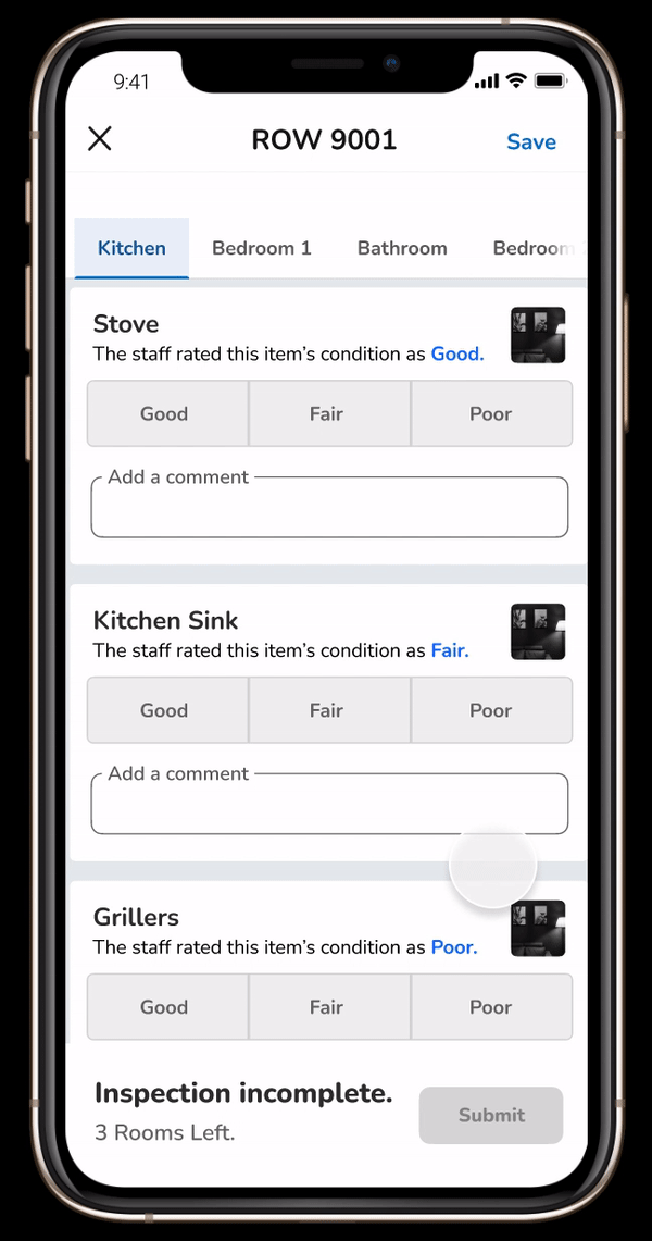
By understanding this persona's motivations, I was able to piece together how the student would check into the university, book their room, and provide a rating for their room items.
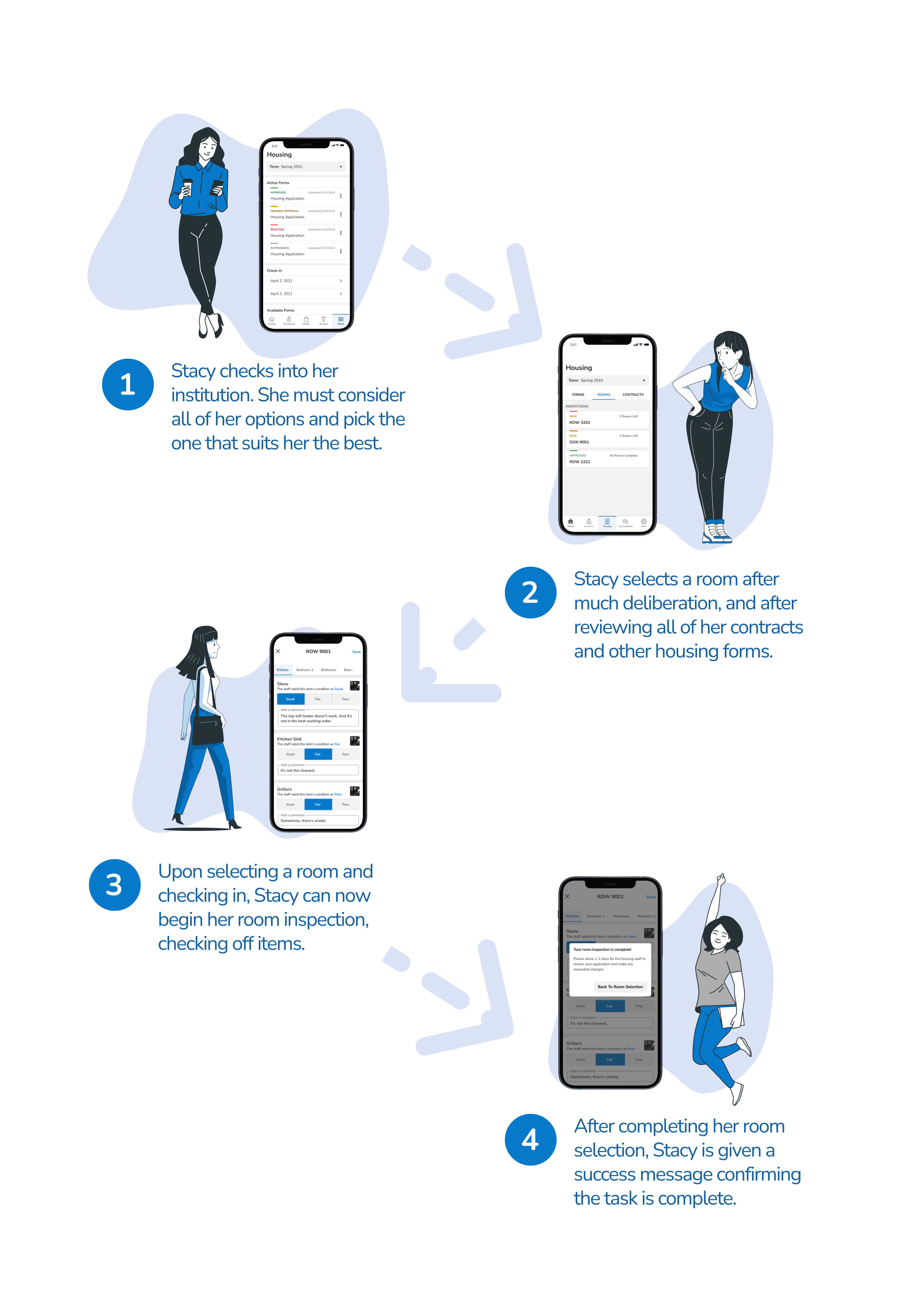
As I continued to think about the design behind the Room Inspection feature, I sketched out some basic concepts. Below are lo-fidelity components of this new feature.
.png)
As I constructed the lo-fidelity prototypes, I thought about 2 facets of good design in this scenario.
.png)
As a result of my findings and the team's initial insights, I was able to produce hi-fidelity prototypes. Featuring the new designs from the lo-fidelity versions, the design incorporated all areas of usability.
You can do that by clicking this link.
You'll be able to click through the full prototype and see my work.
With the right designer, you can do just about anything. It's time to hire someone who knows the science of human-centered design.