This year, ‘UX Designer’ has continued to be one of the most sought-after skills for companies nationwide.
After all, we’re seeing the dawn of something that doesn’t normally get attention at your average company: an increased focus on releasing accessible products.
Companies have begun to recognize the returns in both time and user retention when they accommodate people with disabilities. With 15% of the population alone suffering from some form disability, it makes sense. This has only been accelerated by the pandemic and the resulting rise of remote work.
Research shows that digital products in full WGAC compliance are expected to out perform their competitors by 50% if said competitors aren’t in compliance. And seeing as the digital product market isn’t getting any smaller, competition is fierce.
When it comes to job security, you may be in the clear as a designer already. But having a solid background in designing for accessibility can give you a real edge over the competition should you seek better opportunities.
Besides, crafty as you may be, a slick UX design is nothing if its color contrast causes vision problems. But some good news: accessibility isn’t always about sticking to a hard list of guidelines — it can be about finding a methodology that works for you as well.
Designing an accessible product is no easy task. Getting the basics down means understanding it from multiple points of view — from design, to prototype, to code. And as a designer, there is a high chance you will need to work closely with developers.
So let’s get started with the first basic concept you’ll need to be familiar with.
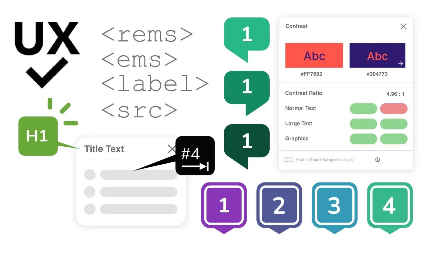
As a product designer, there will be no shortage of projects that where you’ll have to see some form of code. Therefore, it is essential that you understand a few things in order to communicate with developers.
Developers are less likely to understand things from the design perspective. The kicker is that understanding things from their end can be a of great advantage to you. When it comes to designing accessible products, there are a few rules of thumb you can use to get started:
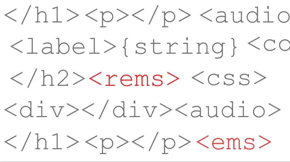
Having a solid understanding of zoom-scale attributes (like <em> and <rem>) is a game changer, too. These attributes, simply put, act as templates for different screen sizes, saving developers (and you, the designer!) much-needed time when building with scaling in mind. Here’s an article by Christine Vallaure that explains this in detail.
Annotation can be a tedious task, but it’s great for bridging gaps between teams. This is because when developers see Figma, they can get confused by the difference in user experience alone. And understandably, getting your feet wet with this subject can be a little overwhelming — especially if your team is still new to designing accessible products.
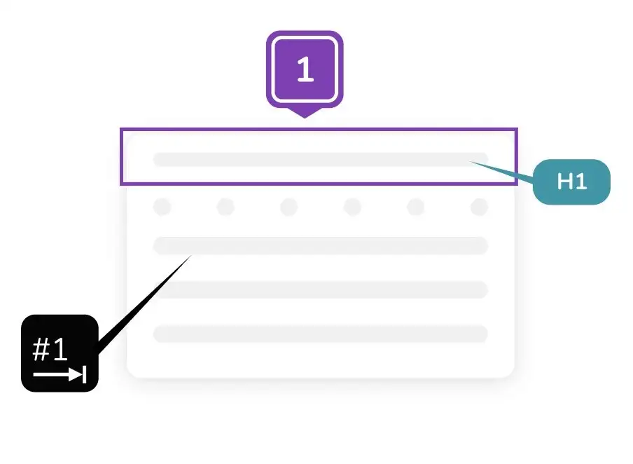
There are two areas where you’ll likely be doing annotations. There’s wayfinding, which covers focus areas, keyboard tabbing/shortcuts, and content structure. Supporting content deals with labels, roles, and their properties as interpreted by screen-readers.
These two areas and their subcategories are identified by visual aids, which are easy to understand and bring clarity to whatever design you’re creating.
The visual aids are as follows:
Designing for accessibility means thinking of content as a tool. When people understand what you are trying to communicate, accessibility becomes a reminder for better decision making.
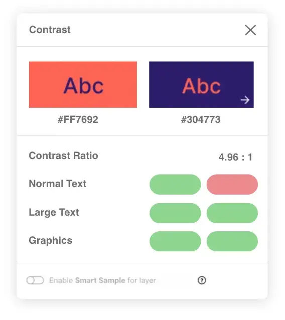
Accessible color contrast is something you don’t want to miss out on: smart devices are becoming a part life for over 98% of us. When paired, colors can help or hinder the user.
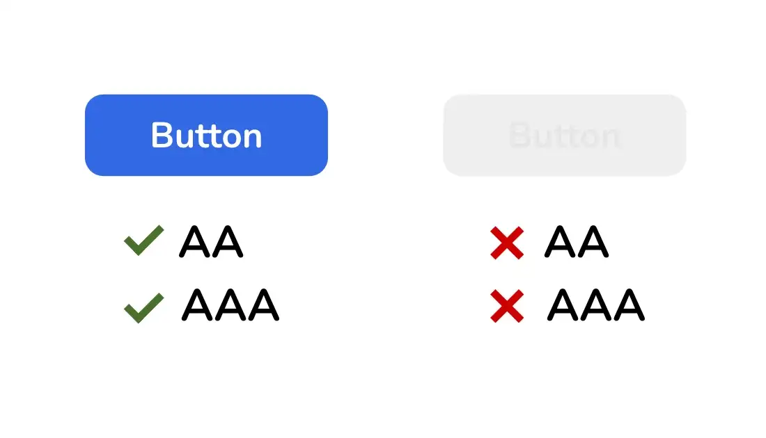
Take these two buttons for example. Which one has text that is easier to see? We can observe that if the background color and text are too close in hue, it’s less visible. Such is the case with the button on the right, which fails to meet both AA and AAA standards.
When measuring contrast, you’ll notice three modes of measurement:
Level A standards are designed to be met without much impact on the website being measured. There are some requirements that are non-button related (such as using page titles and descriptive links) but for the most part, these measure basic color contrast.
Level AA standards mean that the contrast ratio is 4:5:1 — this ratio means the text will still be visible even from afar. Even being resized to 200% doesn’t cause loss to the text or its function as readable content.
Level AAA standards are the hardest to meet. Color contrast needs to be compliant, of course — a 7:1 ratio is needed for the color contrast to succeed here.
As a bonus, if you want to view the full accessibility checklist for all three of these standards, you can download this interactive form online. It includes checkboxes and pass / fail options for each list item.
Accessibility can be a tricky thing to nail down. After all, why else have companies only recently begun seriously investing time and capital into improving their products’ accessibility?
The truth comes down to one simple idea: accessible products are inclusive. When done well, these products take into consideration all possible user types and make the overall experience better for the disabled.
As products become more inclusive, there will be more support for the use of inclusive components and even possibly the invention of an accessible component library, which may already exist on the web.
Personally, I’m, excited to see the possibilities on the horizon. Out with the old and in with the new, after all. If the current improvements in software development processes continues, accessible products will serve all users of the future.


I'm David Louis— a designer who works with startups looking to push creative boundaries